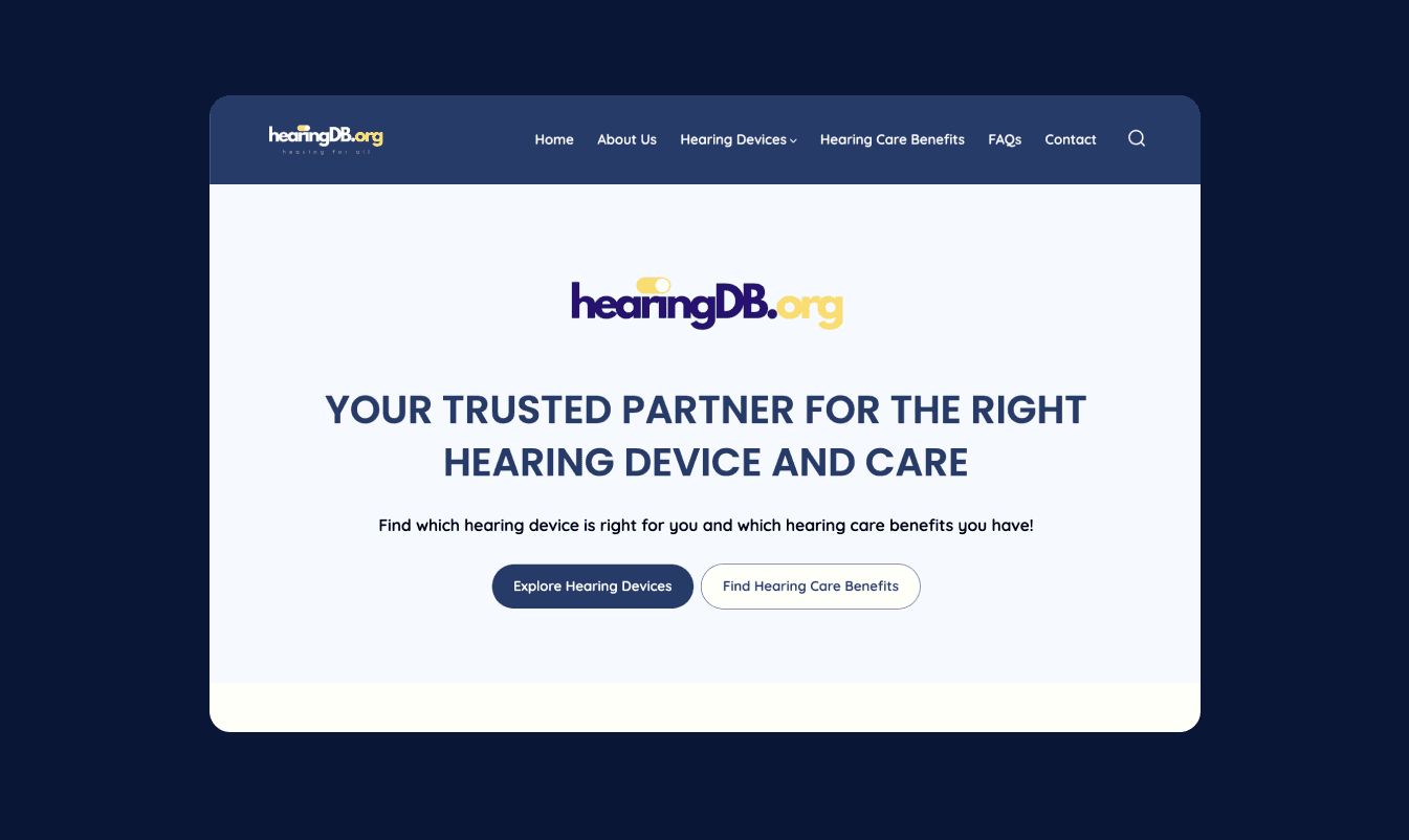
A website with USC Keck School of Medicine to help patients learned about modern hearing devices.
OVERVIEW
Team
Me (Designer)
Janet (Director of the lab)
Role
UX Designer (visionary, developed database, design system, wire framing, prototyping)
Front-End Engineer
Timeline
Sep 2024 - Jan 2025
Tools
Figma, JS, HTML, CSS, Excel, Wordpress
THE PROBLEM

COMPETITIVE ANALYSIS
Competitive analysis with 3 other hearing advising companies

CUSTOMER JOURNEY 1

Challenges
Information overload: difficult for users to understand the hearing aid products
The first challenge was that it was difficult for users to understand the various hearing aids and how it was fit for them. They have to look at the price, if it's for mild or severe hearing loss, if it's OTC or prescribed, etc. There are too many options listed and it's information overload.
The users are not drawn to looking at the information
Then I made an organized database with images integrated into the website so that users can visually see all the information for each hearing aid in a clear way. However, even though the information was more organized and clear, it was still information overload for users. Therefore, I integrated an AI quiz for users to take that would output 1 or 2 hearing aid options that were the best for them.
CUSTOMER JOURNEY 2

LOGO

FONTS
Quicksand
COLORS
UX DESIGN PROCESS


FINAL DESIGN
Enhanced the navigational experience
Changed the home page layout of the website. Also changed the color when the user hovers over the button. It was previously a bright yellow hover color.
Developed an interactive device quiz to guide user choices
Developed and designed a beta hearing device quiz to help users determine the best hearing device fit without searching through all the different databases.

Improving the visual design and color patterns
Added a new section to the home page to create more clarity about what the website provides. I added descriptions and example images.

IMPACT
Before, there was a spreadsheet and a seperate website. When I finished this project, I merged the 2 to allow users to view the spreadsheet information in a user-friendly way.
TAKEAWAYS
There is alot of data used in this website. Therefore, it’s important to organize the data in a way that the users can understand.
My supervisor and professor went to a conference and showed people the website. They gave thorough feedback and was crucial in re-designing the website to help the users.
CHALLENGES
There are many databases that are connected to the website; therefore, I had to make many changes to the multiple databases used on the website.
WHAT I LEARNED
This was my first project working with developers and I learned how to become a better designer. I realized my developers relied heavily on Figma ‘Dev Mode’ and learned how to auto layout my designs so it can be easily understood on the dev mode side. Before I used auto layout and dev mode, my designs visually looked the same but internally messy. It was difficult to communicate with them because they would ask for the padding and I would make up a random number. When they coded my designs, the UI didn’t match up such as the color was a different Hex number, the fonts weren’t the same, and they used random drop shadows. After reorganizing the format of my designs and communicating with them my UI standards, the designs slowly started to change to look like mine. It still wasn’t perfect at the end, but it taught me alot about communiation.
This was my biggest solo design project and staying organized was important. Instead of having frame 1590, I labeled the frame to “login frame”. I copied each new iteration onto another page. I organized the style guide with components for efficiency. I learned how to use auto layout to organize all my designs. These are design habits I learned and will be continuing for all future projects.
I never designed my own pitch decks and rarely used them besides class presentations. With weekly pitches by my PM, I had to create weekly pitch decks to match her pitch. I learned how to use innovative Figma animations and how to tell her story through a creative deck. This process was the most challenging for me as the first impression of our product was through the pitch deck. However, I realized the pitch deck is powerful in telling the story and can move investors to want to invest or spread awareness of our product.