A website that helps shoppers find people to split expensive international shipping costs with to make international shopping easier!

OVERVIEW
A startup created through USC’s premiere incubator LavaLabs. My team and I also won the “Best Demo” award at LavaLab’s Demo Day.
Team
Role
Lead Product Designer
Oversaw vision, strategy, created the design system, marketing, experience design, designed weekly pitch decks, prototyping, wireframing, branding, UX research
Timeline
Feb 2024 - Apr 2024
Tools
Figma, CSS, Figma dev
Sneak Peak


THE PROBLEM
RESEARCH
RESEARCH OVERVIEW
Interviews
Interviewed over 30 people and discovered pain points
Quantitative
Analyzed over 10 reports and articles and media stats like reddit threads
Journey Map
Examined 3 user journey
RESEARCH
PERSONAS
USER PERSONA 1
Sam!
Sam lived in Europe for a few years and just moved back to the U.S. He misses his favorite European stores and can’t find any clothes he likes in the U.S. He wants to purchase clothes from abroad but finds the shipping fee to be quite expensive. None of his friends want to group order because they’re not interested in fashion like him.
USER PERSONA 2
Melody!
Melody is a huge kpop fan. She regularly purchases fan products and collects fan cards. To purchase these kpop products, she goes through a long and sketchy process. She finds resellers on Instagram and sends them money hoping that they aren’t a scam. She finds it difficult to purchase her desired products and finds the process tiresome, suspicious, and not reliable.
RESEARCH
FINDINGS & SOLUTIONS
01.
There’s a huge market for people that purchase products from abroad
71 million people that purchase overseas e-commerce orders in the US every year and it’s a $160 billion e-commerce market. People buy from multiple stores having to pay multiple international fees, and shipping costs.

02.
Purchasing products from abroad is confusing and the UI of the international websites are poor
Many popular international brands have both a local and international website. The international website is usually not updated as much and can be difficult to order from.
Design one centralized website with clean and user friendly UI. Users can easily search up their favorite products.

03.
The payment process can be unsafe and not reliable.
Many people are suspicious of the international payment process or find it difficult. Many kpop fans pay with venmo before receiving their product.
Implemented customer’s preferred payment methods such as Visa, American Express, etc.
CHALLENGES
Our market kept changing so the product kept changing.
Initially it was for kpop fans to make the market specific. Then we made it more broad to any customer purchasing products abroad.
We had too many feature ideas and needed to simplify the product.
We wanted to implement too many features. Our MVP was suppose to be quite simple with only basic features.
I’ve never made used Figma animations and pitch decks on Figma.
It was a huge learning curve using animations on Figma. It was alot of fun but very tedious. I also learned to make interactive pitch decks on Figma.
COMPETITIVE ANALYSIS
Description of competitive analysis

BUSINESS MODEL & PITCH DECK
Final pitch deck with animations
CUSTOMER JOURNEY
Sitemap and user flow

UX DESIGN PROCESS




https://www.chungiyoo.com/

iteration 1


iteration 2
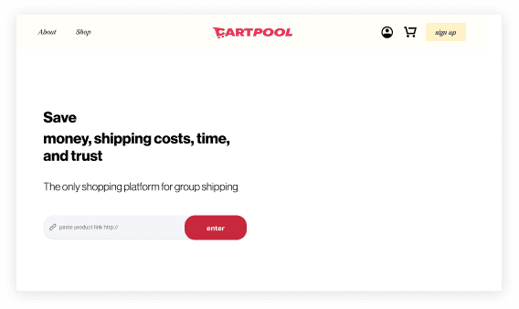

iteration 3

TYPOGRAPHY
Aa
Neue Haas Grotesk
Aa
Redaction
BODY
margin: 64 px
padding: 24 px
Display 1
Neue Haas Grotesk, Bold, 5%, 60 pt
Heading 1
Neue Haas Grotesk, Bold, 0%, 44 pt
Heading 2
Neue Haas Grotesk, Regular, 0%, 36 pt
Heading 3
Redaction, Regular Italic, 0%, 32 pt
Heading 4: used for captions
Neue Haas Grotesk, Regular, 0%, 20 pt
paragraph
Neue Haas Grotesk, normal, letter space, 16 pt
paragraph 2
Neue Haas Grotesk, weight, letter space, 14 pt
PARAPGRAPH
8
40
Lorem ipsum dolor sit amet consectetur. Purus sed blandit tincidunt a. Sapien id pulvinar pellentesque interdum volutpat leo ac.
COLOR PALETTE
Hex #E62D4E
Hex #F6B4B3
Hex #FFF1C6
Hex #333333
Hex #FFFFFF
Hex #ECDED6
drop shadow
x: 0 px
y: 16 px
blur: 40px
apha: 205
color: #7090B0
BUTTON
Normal
Hover
Normal
Hover
Normal
Hover
Normal
Hover
FORMS
Textfield
Empty Field
Fill in text
Disabled Text
Error
Error
Search
Text
Keywords
Dropdown
Normal
Password
••••••
Forgot Password
Dropdown List Value
Label
Label
Label
Label
Dropdown Multiselect
Label
Label
Label
Label
LOGOS


PAGINATIONS PAGES
1
1
1
1
...
1
2
3
4
...
16
UX DESIGN PROCESS
TESTING

UX DESIGN PROCESS
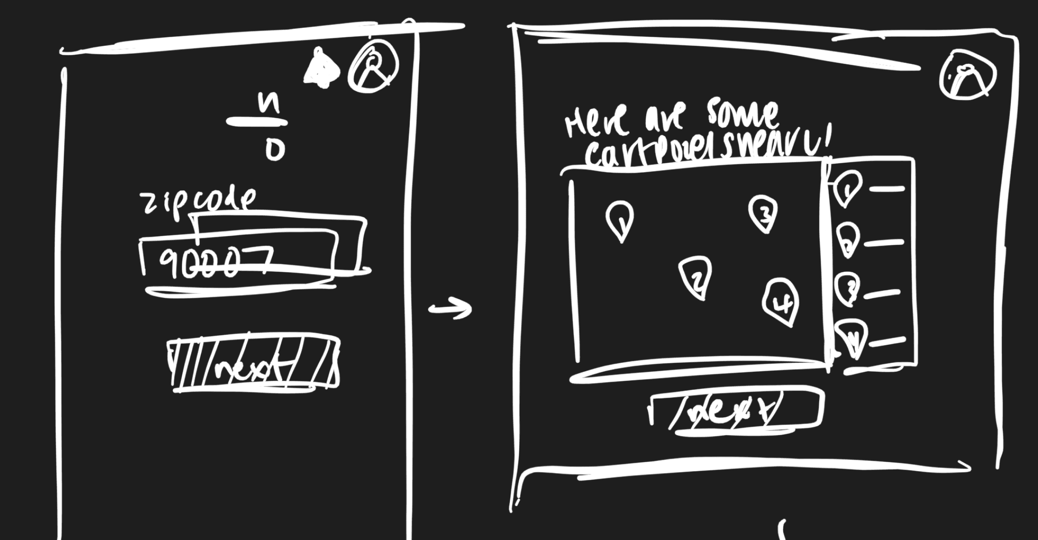
ITERATIONS
FINAL DESIGN
Landing page (physically scroll to through the image view entire page)

Customer journey (video of prototype)
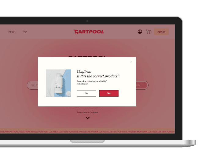
Paste a link from a product (confirm window)
Cart Page

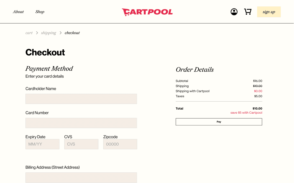
Checkout Page

Experience design for potential users at LavaLab's Demo Day


Pitching the product


WHAT I HAVE LEARNED
This was my first project working with developers and I learned how to become a better designer. I realized my developers relied heavily on Figma ‘Dev Mode’ and learned how to auto layout my designs so it can be easily understood on the dev mode side. Before I used auto layout and dev mode, my designs visually looked the same but internally messy. It was difficult to communicate with them because they would ask for the padding and I would make up a random number. When they coded my designs, the UI didn’t match up such as the color was a different Hex number, the fonts weren’t the same, and they used random drop shadows. After reorganizing the format of my designs and communicating with them my UI standards, the designs slowly started to change to look like mine. It still wasn’t perfect at the end, but it taught me alot about communiation.
This was my biggest solo design project and staying organized was important. Instead of having frame 1590, I labeled the frame to “login frame”. I copied each new iteration onto another page. I organized the style guide with components for efficiency. I learned how to use auto layout to organize all my designs. These are design habits I learned and will be continuing for all future projects.
I never designed my own pitch decks and rarely used them besides class presentations. With weekly pitches by my PM, I had to create weekly pitch decks to match her pitch. I learned how to use innovative Figma animations and how to tell her story through a creative deck. This process was the most challenging for me as the first impression of our product was through the pitch deck. However, I realized the pitch deck is powerful in telling the story and can move investors to want to invest or spread awareness of our product.